
My second novel is finished and back from the editor. It’s time to create an eye-catching cover that will make a reader click on the e-book or entice a book store customer take a copy to the cashier. I’m learning step by step. Each cover gets a bit easier and a bit more involved.
 For my first two covers (Eternally Yours, Robert and Home Run), I simply found an
 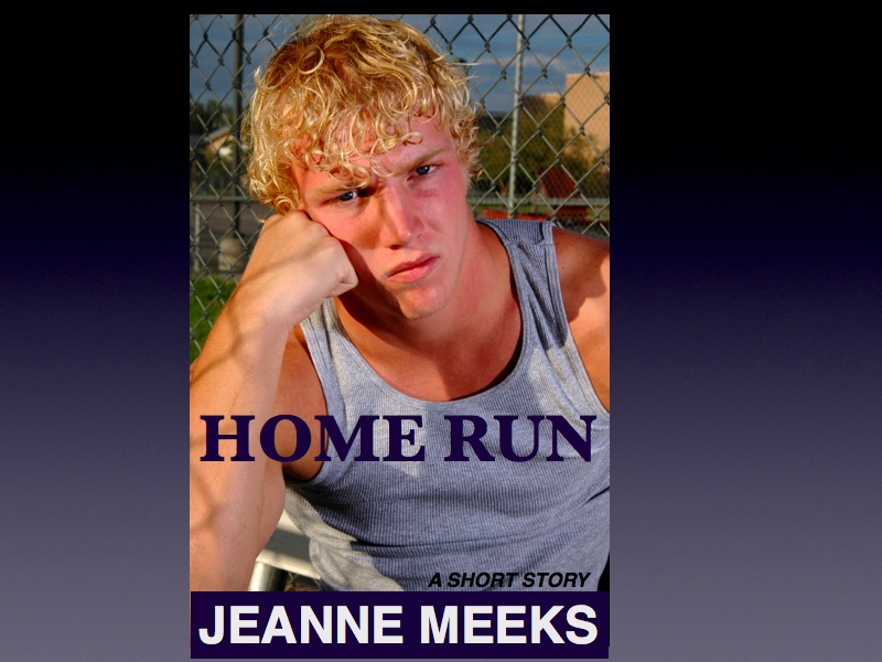 attractive photo on Flicker or istockphoto to download into Amazon’s Kindle creater. I superimposed the title and author name on open spaces on the photo. Easy, but no one will be fooled into thinking a professional designed the covers.
I spent much more time with Rim To Rim‘s cover because I needed a back cover for the paperback version. Createspace is a great tool, but the structure is rigid and limited. Createspace offers a number of formats to choose from, but if none fit, the author/designer must adapt. I tried a number of photos looking for one on which the pre-positioned title and author spaces looked well against the background photo. The color combinations were also limiting. The formats have pre-designed text areas on the back of the book for testimonials, author pictures, excerpts, etc. Easy, but one-size does not fit all.
 For my second novel, I’ve learned how to use photo editing (picmonkey.com) software to design a cover photo which I will download to Createspace.
How I Created the Cover for Wolf Pack
 1) Find a professional photo that gives a sense of the genre or theme of your novel. Use key words to search the archives of Flicker.com or istockphoto.com. Very affordable photographs are available. Choose a photo of at least 300 dpi and at least 6×9 inches if you plan to produce a printed book. Download a complimentary sample photo (with the iStock logo across it) to practice and make sure you like the end result.
2) After playing with fonts, colors, and special effects, pay for and download the picture.
3) Select a texture to give an over-all look, if desired. In this case I chose light streaks which created the orange and yellow horizontal lines. I heightened the color intensity as well.
 4) Practice with overlays. The stars above the wolf are examples. I faded them to make them very subtle. Save your work to your computer, maybe in with your book documents.
5) Title Font – Picmonkey provides a list of fonts, but none were quite right for this photo. I searched the internet and found several fonts which I downloaded to my computer’s word processing software. I then typed WOLF PACK in the new font in a PDF file and converted it to a jpeg file. ![]()
Go back to Picmonkey and open the title jpeg file from your computer. Work with the title’s size, color, shadowing, overlays, etc. In this case I used the same light streak texture as on the wolf. ![]() I manipulated the saturation and position to get more of the orange and less purple. I added a few stars as an overlay and saved the title as a new jpeg file on my computer.
I manipulated the saturation and position to get more of the orange and less purple. I added a few stars as an overlay and saved the title as a new jpeg file on my computer.
 6) Overlay the Title onto the Wolf photo: From Picmonkey, choose the Wolf photo file to edit. Next, choose Overlays – Create Your Own and import your Title jpg file. Position the overlay onto the Wolf photo. Move it around until you’re happy with the size and position. Save.
7) Author name: Chose a font different that the title. Vary serif with non-serif, etc. I could have chosen a contrasting color and set it against the black photo. Instead, I chose a banner from Overlays, fit it into position and colored it yellow. I then chose another identical Overlay banner, but in orange, and positioned it slightly off to the side. Open Add Text and type in the author’s name. Size and position the text on top of the banners.
 8) Adding other text and elements: Saving your design will lock all elements into place. You may open the design again and add text boxes or overlays, but you may not move the originals. I didn’t care for the coloring of the title in the photo above, so I re-did only the title, created a new overlay, and positioned it on top of the locked-in title. I also added text along the bottom, varying the font size, color, and type. I filled in black areas with a leaf overlay in the left hand corner and an overlay of fireworks in the right bottom corner.
When the cover is as good as I can think to do it, I’ll open Createspace’s cover design and download the final jpg file.
I’ve sent out a copy of my cover design to friends asking for opinions and suggestions. What do you think? After listening to suggestions, I dropped the banner and enhanced the author name (using a separate picmonkey jpg file) with the same overlay treatment as in the main photo. To make the photo fit into the 6×9 template for Createspace without running outside their margins, I opened a picmonkey rectangular design, made the canvas black, cropped it to 6×9 and overlay the otherwise completed cover photo onto the black to create the borders. Now I’m happy and the cover is official.


Nice bloog thanks for posting
LikeLike